Introduction
Websites are a cornerstone for most businesses in 2024. They are the centre of their digital ecosystem and a necessity for attracting new customers and retaining existing ones. But did you know that the colours you choose for your website can significantly impact how your visitors interact with your business?
Studies show that colour psychology can influence up to 85% of a customer's buying decision (Source). This means that the right colour palette can be the secret weapon that transforms your website from a virtual storefront into a conversion machine.
In this article we will explore colour psychology in web design, helping you to select colours that will leave a lasting impression on your visitors and nudge them towards your desired action.
Understanding Colour Psychology
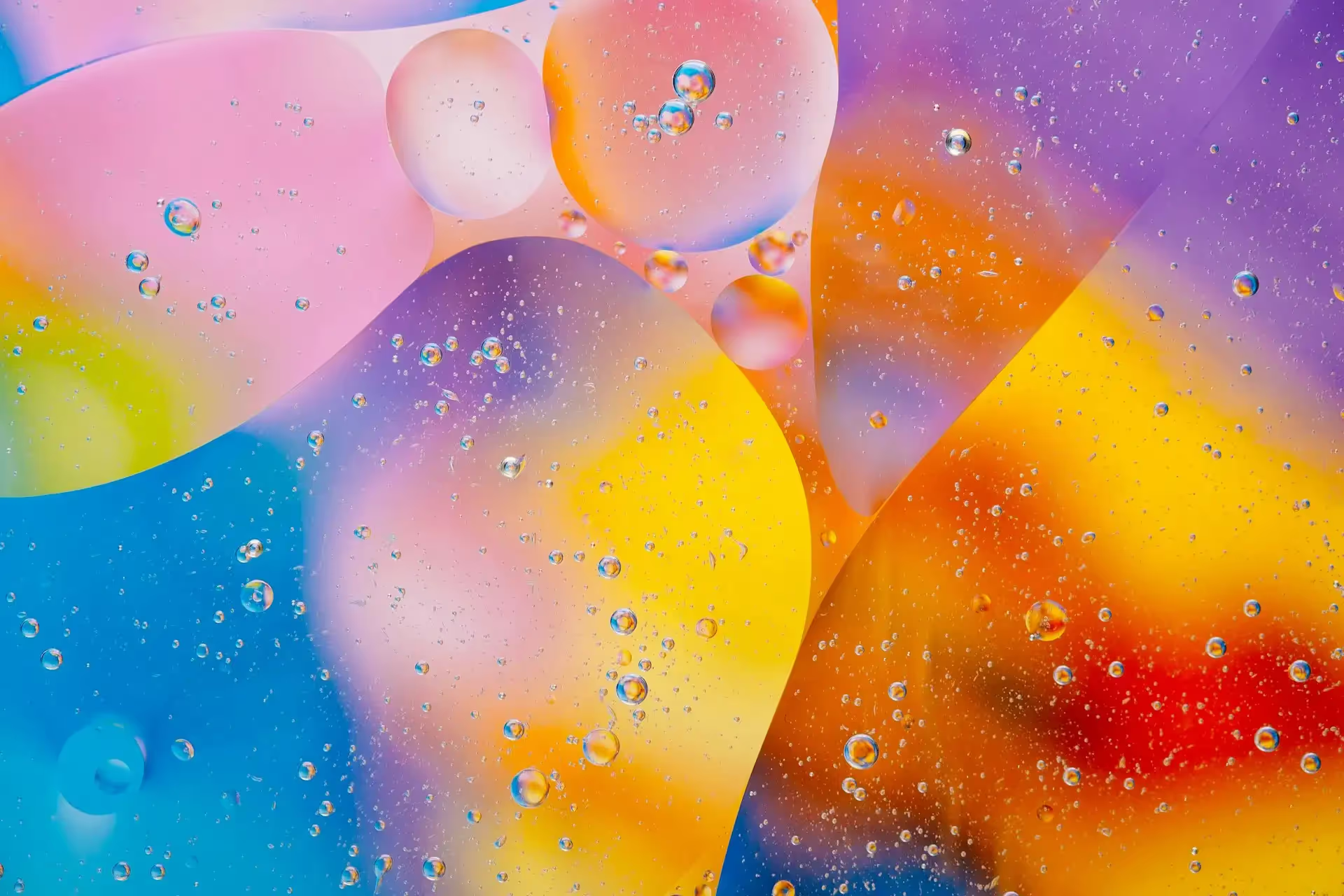
Colour psychology studies the impact of colour on human perception and behaviour. Colours can evoke a wide range of emotions, memories, and associations. For instance, vibrant reds can trigger cravings for strawberries, while calming blues can induce feelings of peace and tranquillity related to a clear blue sky!
Understanding these associations is key to using colour strategically in website design.
The Impact of Colour on Conversions
No matter what your desired action for your website visitors, whether that be a newsletter subscription, purchase, or registering for an event, colour theory should be considered. Colour plays a significant role in conversions by influencing user behaviour. Strategic colour choices can make these key influences on your visitors.
Guide Users Towards Actions
A strategically placed call-to-action button in a contrasting colour can grab attention and encourage visitors to click. Focus on not only the placement and language used, but colour choices of your CTAs.
Create a Sense of Trust
Certain colours, like blue and green, are often associated with trustworthiness and reliability. Using these colours can put visitors at ease and make them more likely to engage with your website.
Leave a Lasting Impression
A well-considered colour palette that aligns with your brand message can create a visually appealing and memorable user experience. This means you will retain more customers as well as attract new ones.
Choosing the Right Colours for Your Website
Selecting the right colours for your website requires careful consideration of several factors. Here's a step by step approach.
Step 1: Consider the Meanings Associated with Different Colours
Each colour carries specific connotations that can influence user perception. Here's a brief overview of some common website colours and their associated meanings.
- Red: Represents love, passions, urgency, or aggression. Use sparingly for accents or highlighting important information.
- Orange: Evokes feelings of energy, enthusiasm, and playfulness. Ideal for backgrounds or call-to-actions.
- Yellow: Symbolises happiness, optimism, and caution. Use strategically for call-to-action buttons or icons on dark backgrounds.
- Green: Represents nature, growth, health, and wealth. A versatile colour suitable for backgrounds, images, and accents.
- Blue: Creates feelings of trust, security, and calmness. Use moderately for backgrounds, images, and accents, but avoid overuse.
- Purple: Associated with luxury, creativity, and femininity. A sophisticated choice but ensure a balance between light and dark shades.
- Pink: Represents femininity, love, and softness. Use sparingly for accents or buttons to maintain a balanced look.
- White: Signifies cleanliness, purity, and spaciousness. A universal base colour for websites.
- Grey: Represents neutrality, professionalism, and sophistication. Use moderately for backgrounds or balancing out white space.
- Black: Evokes feelings of elegance, power, and mystery. Use sparingly for text or balanced with white and bright colours.
These are general associations and variations can exist. It's always a good idea to conduct additional research specific to your target audience!
Step 2: Consider Recommended Colours for Your Industry
Certain industries have established colour associations. For example, blue is commonly used for healthcare websites, while orange for fitness. Researching recommended colours with your industry can provide a springboard for your design choice. However, don't feel restricted by these associations.
Step 3: Consider Your Target Audience
Understanding your target demographic's colour preferences is crucial. Age, gender, and cultural background can influence colour perception. Studies suggest that men generally prefer cooler colours, while women prefer warmer. Consider these factors when choosing your colour palette.
Step 4: Remember Colour Combos
The impact of colour goes beyond individual hues. The way you combine colours plays a significant role in user experience. You should consider:
Number of Colours
It's generally recommended to use no more than three primary colours for your website. This maintains a cohesive and visually appealing look. Following the 60-30-10 rule for colour distribution can be a helpful guideline. This rule suggests using 60% of your dominant colour, 30% of your secondary colour, and 10% of an accent colour.
Colour Harmony
These are different colour harmony principles you can use to create pleasing colour combinations, some methods include:
- Analogous colours: Colours that sit next to each other on the colour wheel.
- Complementary colours: Colours that sit opposite each other on the colour wheel.
- Triadic colours: Colours that are three positions apart on the colour wheel.
Accessibility
It's crucial to ensure your website's colour palette meets accessible web design standards. This means ensuring enough contrast exists between text and background colours for users with visual impairments.
Colour Psychology in Action
Consider some real world examples of how companies leverage colour psychology in their website design. For example, Shopify uses a prominent green colour which is associated with growth and wealth. This aligns perfectly with their mission of being a platform that grows e-commerce businesses.
Another example is McDonald's. The fast food chain's iconic red and yellow combination is a great example of utilising colour psychology. Red stimulates appetite, while yellow evokes happiness and warmth leading to an irresistible combo!
The possibilities of colour psychology are endless. By understanding the psychology behind colours and applying that knowledge strategically, you can create a website that resonates with your target audience and achieves your business goals.
Final Thoughts
In conclusion, colour psychology can be a powerful tool in web design. By understanding how different colours evoke emotions and influence user behaviour, you can build a website that resonates with your target audience and drives conversions.


.avif)